Avela
Avela is a web platform that seeks to streamline school enrollment process for families and staff in the US. Here we'll focus on ’Avela Apply’, the online portal for parents.
#education #multi-platform #enrollment #web
Visit website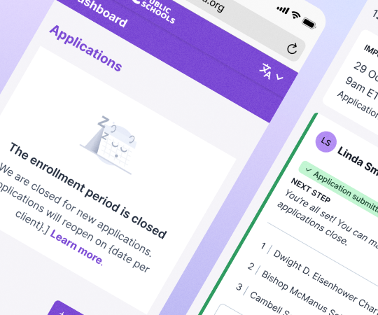
Avela is a web platform that seeks to streamline school enrollment process for families and staff in the US. Here we'll focus on ’Avela Apply’, the online portal for parents.
#education #multi-platform #enrollment #web
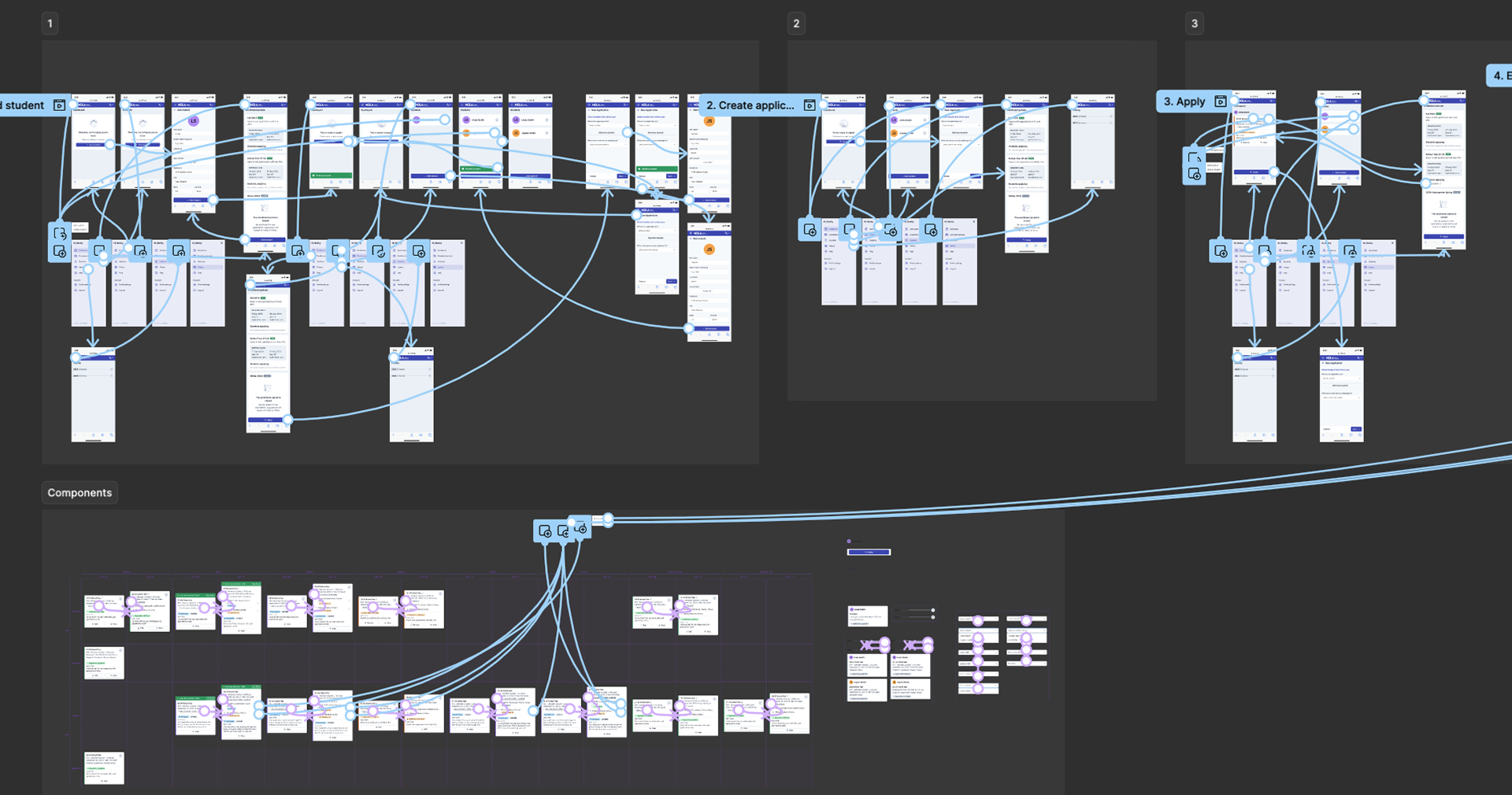
Visit websiteThis is the following step after receiving the briefing and discovery. It is important to identify breaks in the user journey and make sure all scenarios are covered.
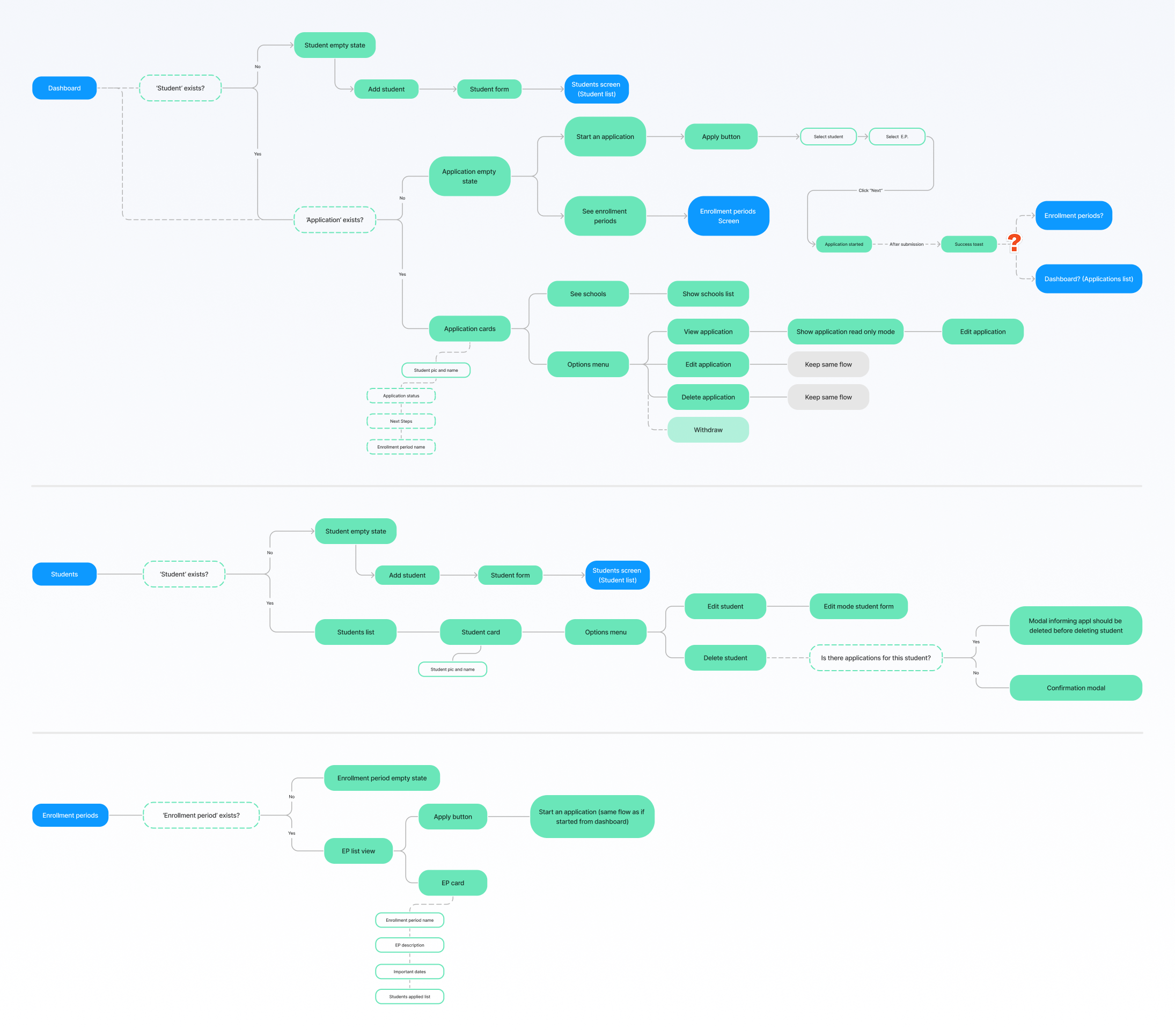
Besides creating the concept of the initial structure and number of screens, this step is necessary to define information hierarchy and address gaps between design and development, in terms of data and technical viability. Se we would meet with PMs and Devs to discuss how each element would be implemented and ensure we were provided all of the data used in the interface.
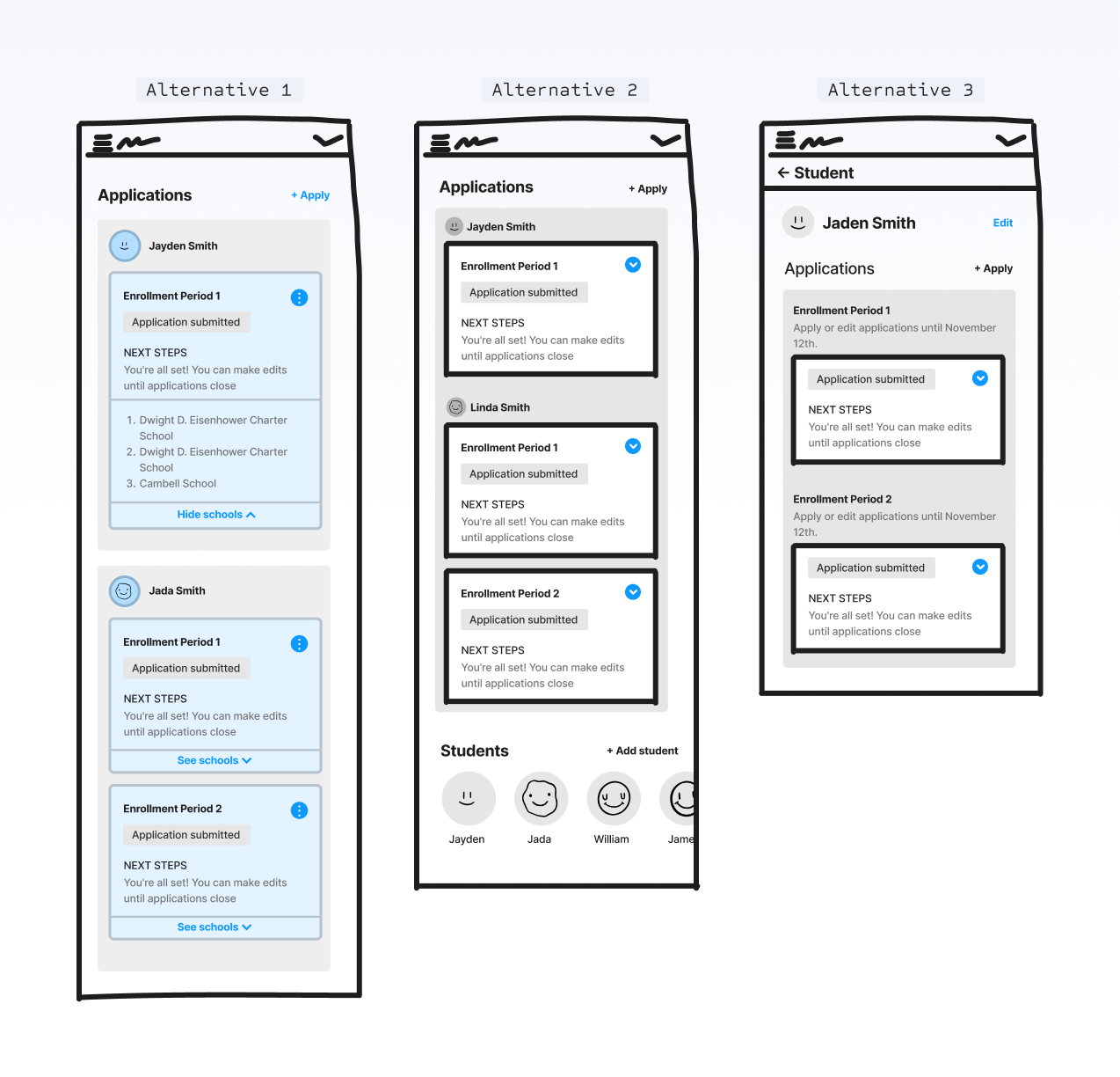
Wireframes with different proposals for the 'Dashboard', the most important screen of the product. The challenge was to understand the best way to group and present the students' and school application information; both being elements of high importance through the parent portal.
It was also important to test the structure with data as close to reality as possible, so we had to consider: school names were usually very long, what would happen if the parent had more than 1 or 2 children, and how to bring attention to time-sensitive notifications without causing cognitive overload.
After double checking the wireframes with Devs and PMs, we would create the high fidelity screens, applying branding with the chosen library, Chakra UI. The visuals must be as simple as possible, since this can be an overwhelming process for parents.
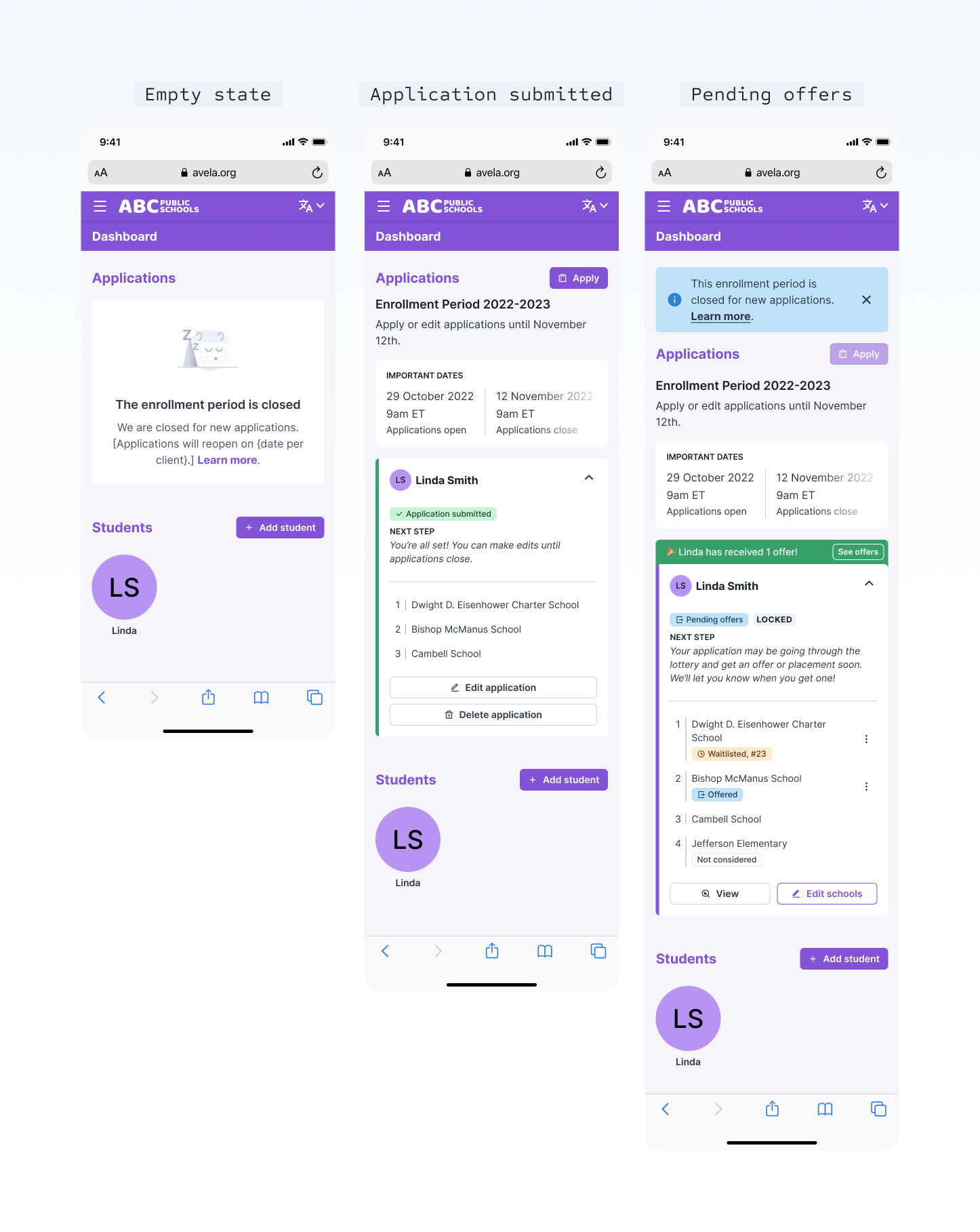
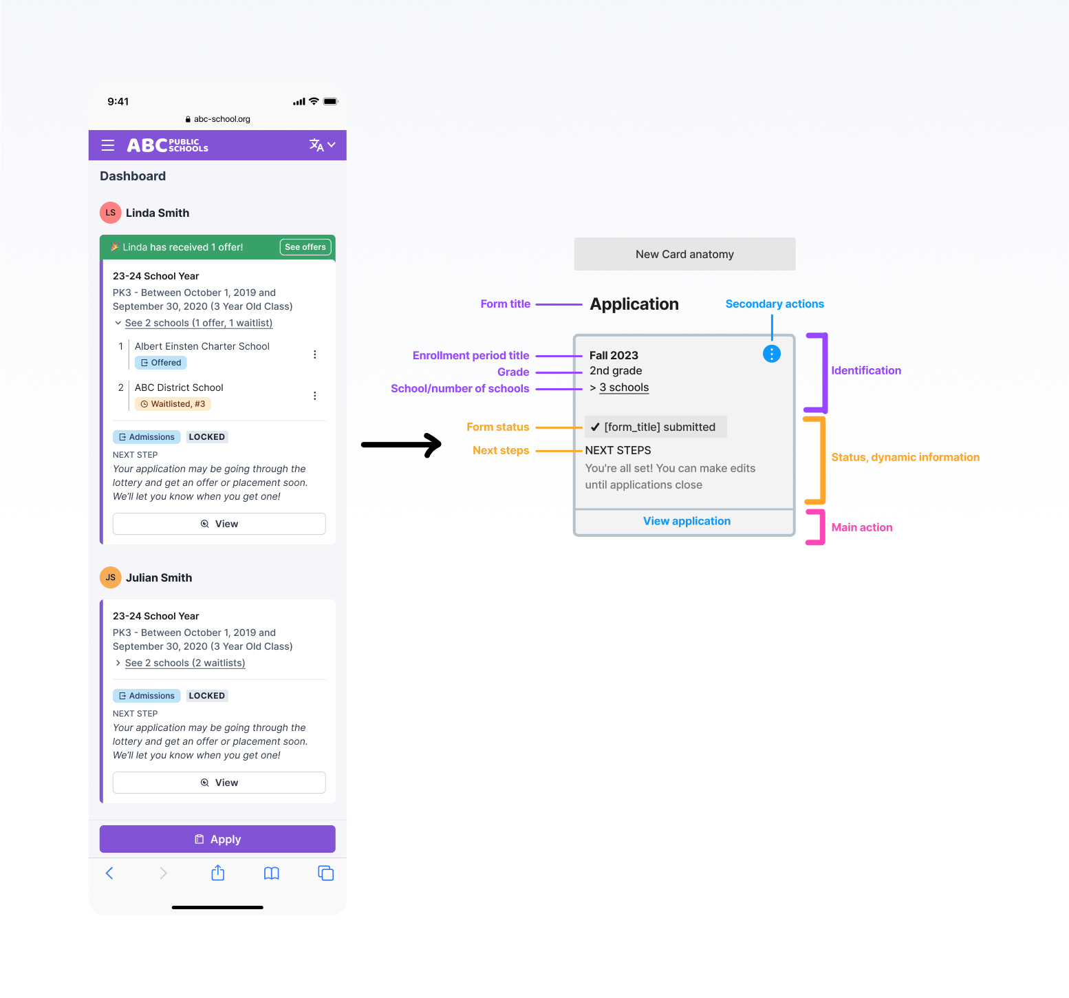
With aesthetic elements in place, I adjusted the visual hierarchy, going in depth into the anatomy of important components, making sure to use real data to test its effectiveness.
To ensure we were providing the best experience for parents, I had the opportunity to plan and execute usability tests with 7 sets of parents. This process involved the following steps:
1. Defining goals and flows to be tested;
2. Producing the clickable prototypes on Figma;
3. Writing the interviews script, with tasks and questions for the parents;
4. Guiding the interviews, instructing and getting insights from the interviewed;
5. Gathering the qualitative data and extracting quantitative bits;
6. Writing a report with findings and improvements to be made;
7. Applying changes to the interface.
This case study showcases only a fraction of the project to provide an overview of my process. To know more about it, schedule a meeting, and I'll be happy to present the entirety of this project to you.


Easily plan events and track special dates with an app that adapts to your needs, all in one place.
#mobile-app #events #organize #plan

About me
Hi! I have worked with product design in the tech field for over 8 years, including 3+ years of leadership/mentorship. I'm currently working remotely based in Brazil, but I do have interest in moving abroad.
#catmon #music-addict #sharp-eyes #self-learner
I'm open to one-time projects, long and short-term contracts, full-time, or anything else you might need! Let's talk about it.
or contact me through
